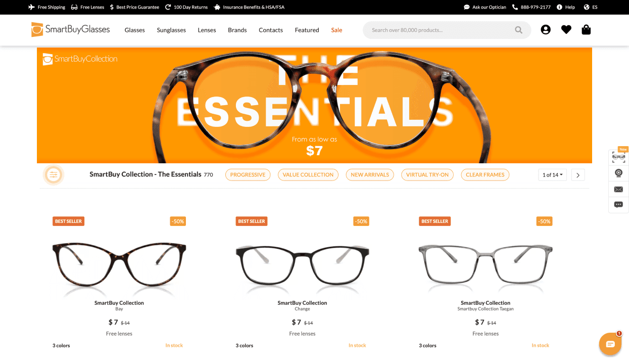
SmartBuyGlasses
This redesign began with my personal search for glasses. During my search, I came across the SmartBuyGlasses website and noticed a banner that I found particulary distracting. That's when I decided to redesign it and include the project to my portfolio.
I started with analyzing the website - its color palette, typography, and overall brand style.

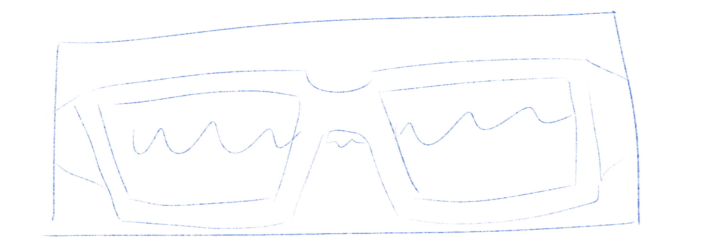
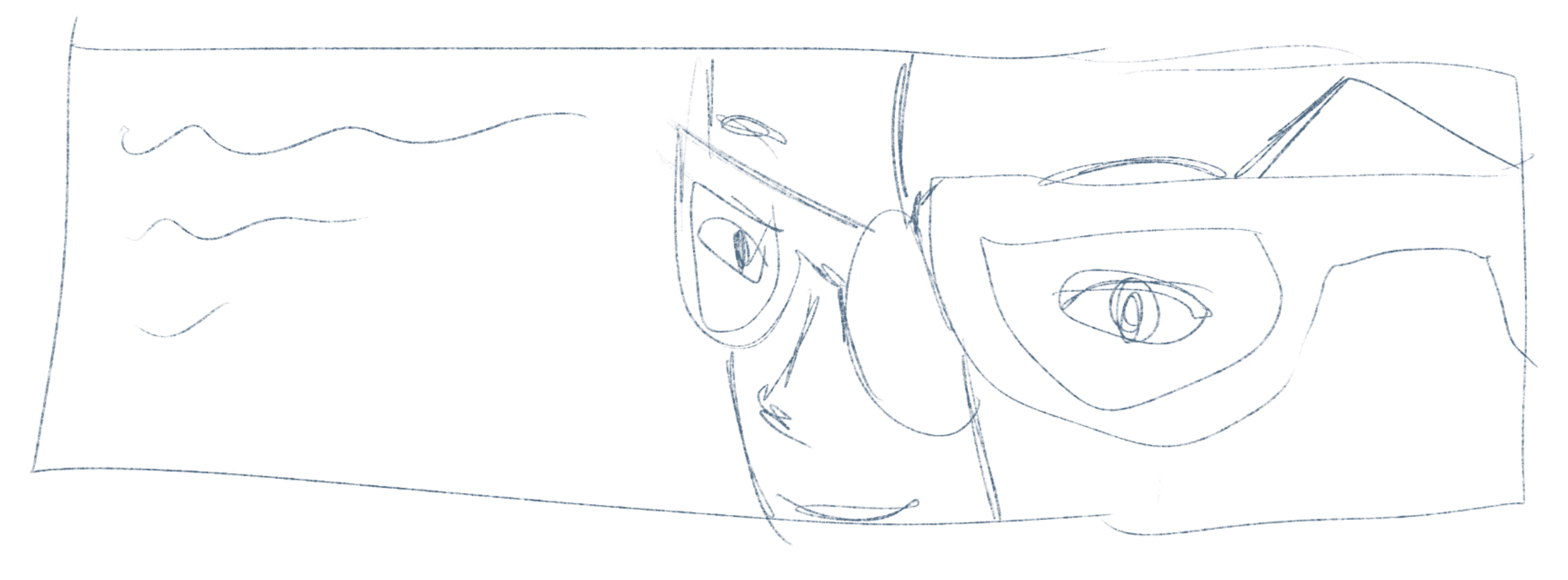
Since I use glasses myself, I already had some ideas on how to design the banner. I quickly sketched three ideas I had in mind. Eventually, I continued developing my first idea, which is the viewpoint of a person using glasses. I chose this idea because people can relate to this poster, which is why it can catch their eye.
After choosing the design idea, I began creating a copy of the logo in Illustrator so that the banner would look more high quality.
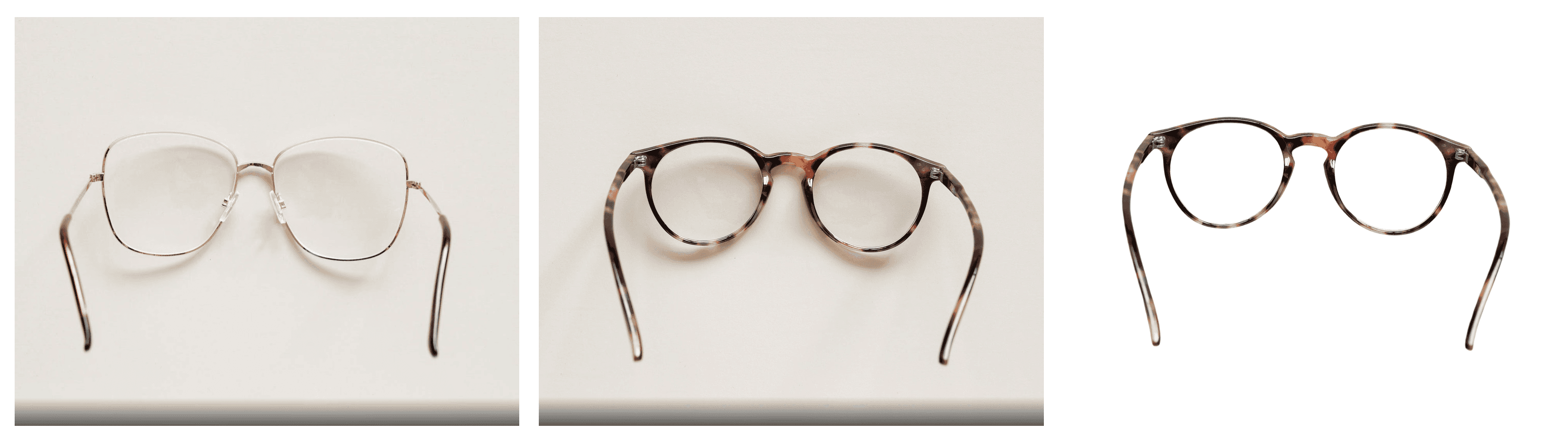
After creating the logo, I searched the photo bank for suitable glasses. I found two pictures I liked and deliberated on which would work the best. I opted for the brown ones due to their thickness. Removing the background from thinner glasses would be more challenging, and I wasn't sure if the thin frames would attract attention in the banner.
After selecting the glasses, I used Photoshop to remove the background from the image:
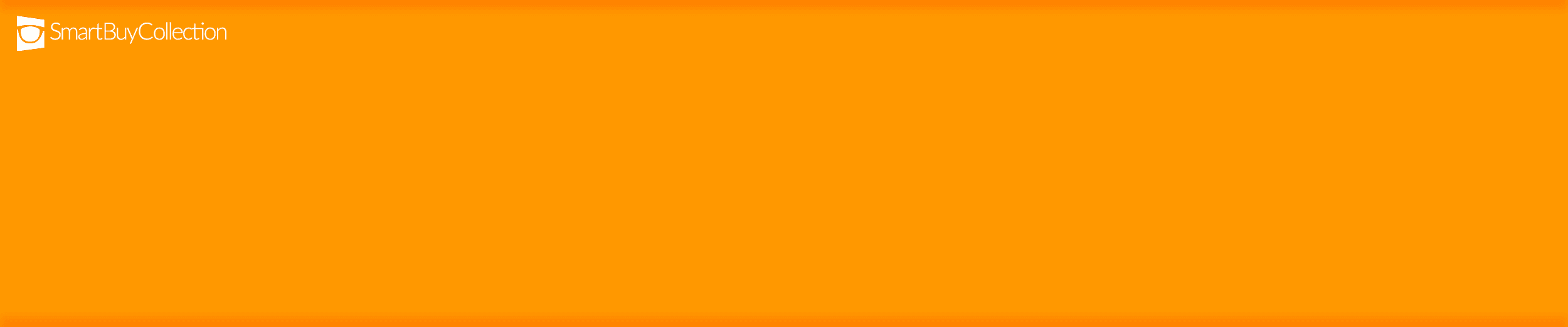
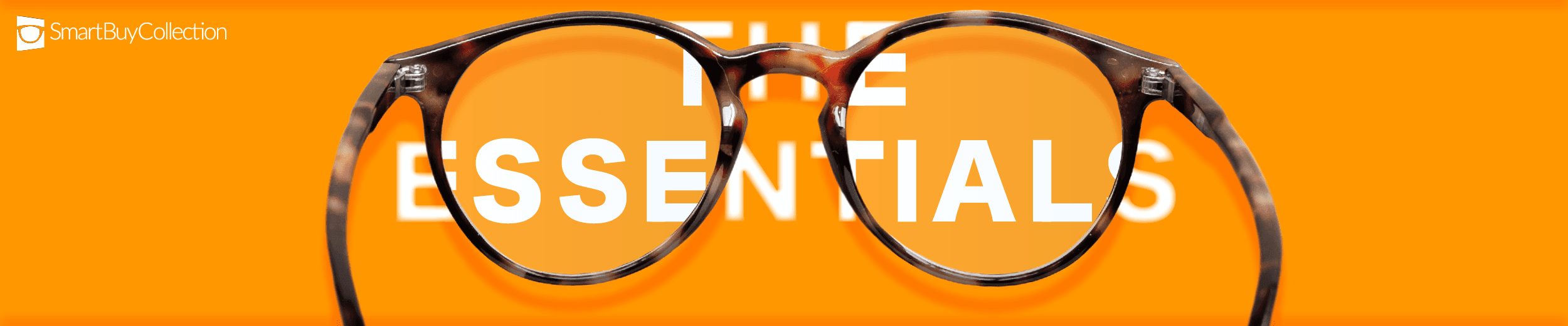
Now, I'm ready to proceed with the design using Photoshop. It's my preferred tool for this type of projects. Opting for the brand's main color, FF9800, I applied it as the background to give the design a catchy and funky vibe
Next, I added the main object - our glasses. To avoid a flat look, I used few effects such as dropped and inner shadows.

Then, I added the text “THE ESSENTIALS”. This addition made more sense as now the text is visible through the glasses, emphasizing that the glasses are the essentials.
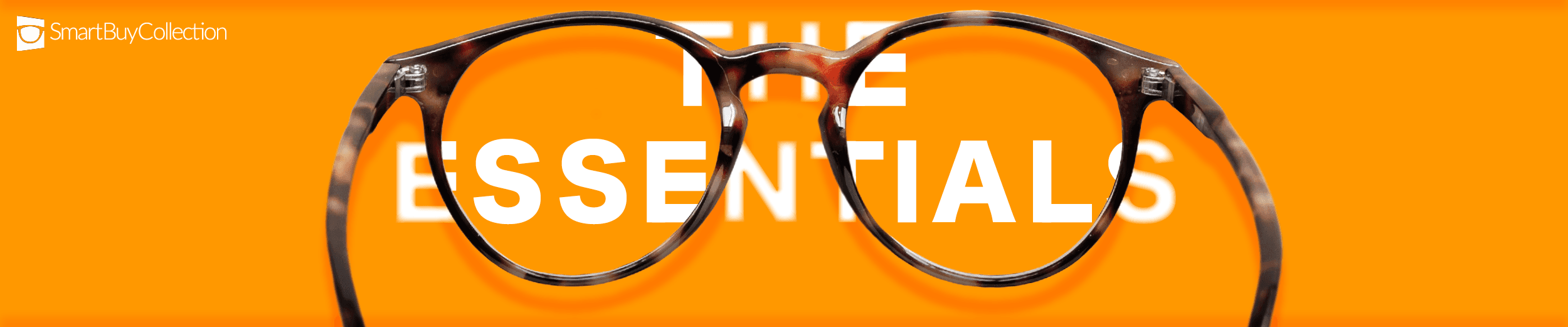
I noticed the glasses still looked a bit flat, so I took a short lunch break to give my brain a rest. When I resumed work, I realized that adding lenses could give the glasses more dimension.
And the final touch was adding a good deal :)

I'm pleased with how the design turned out. It has space to breathe, it isn't overloaded with information, and the composite idea looks interesting and eye-catching.